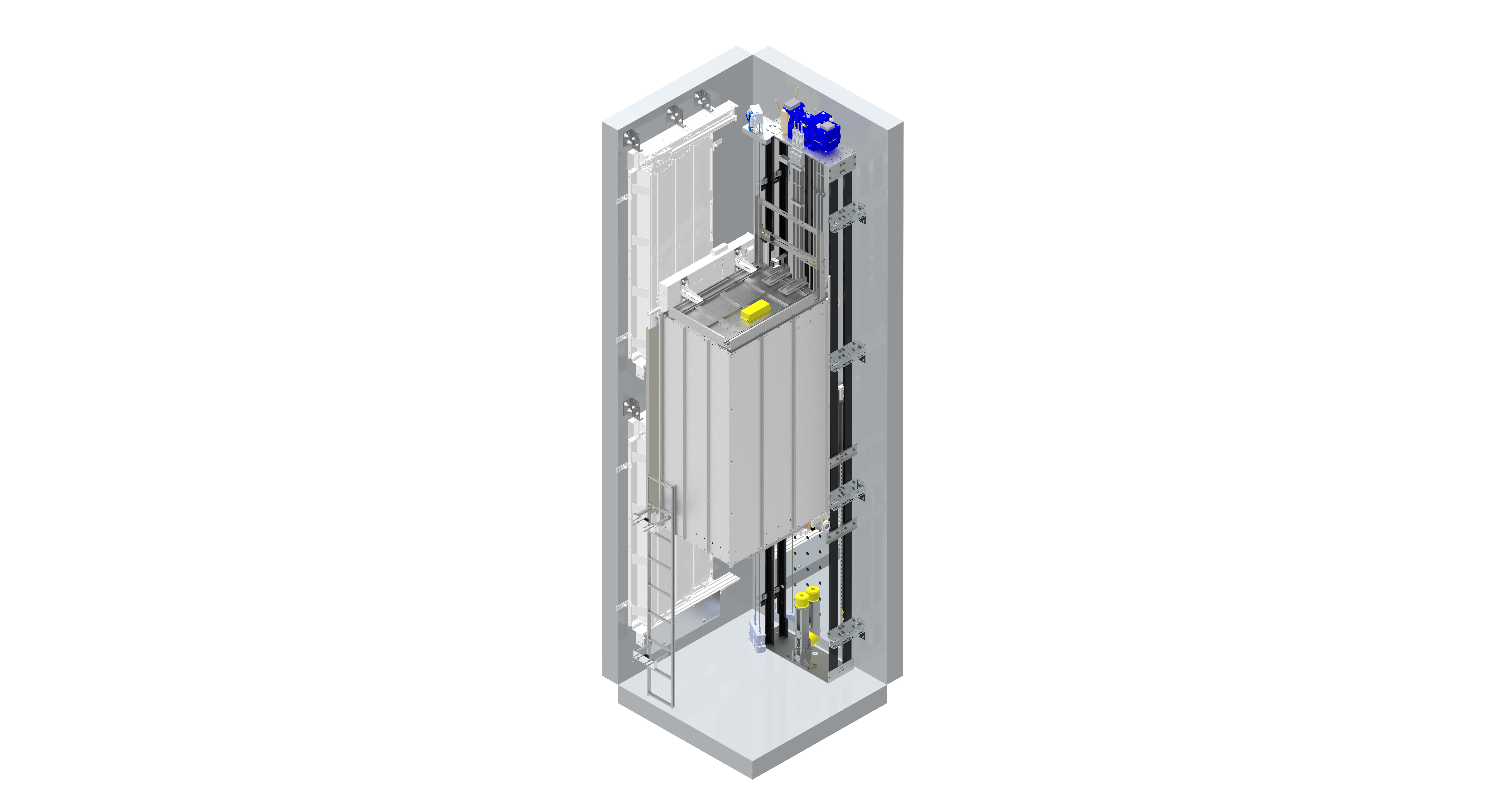
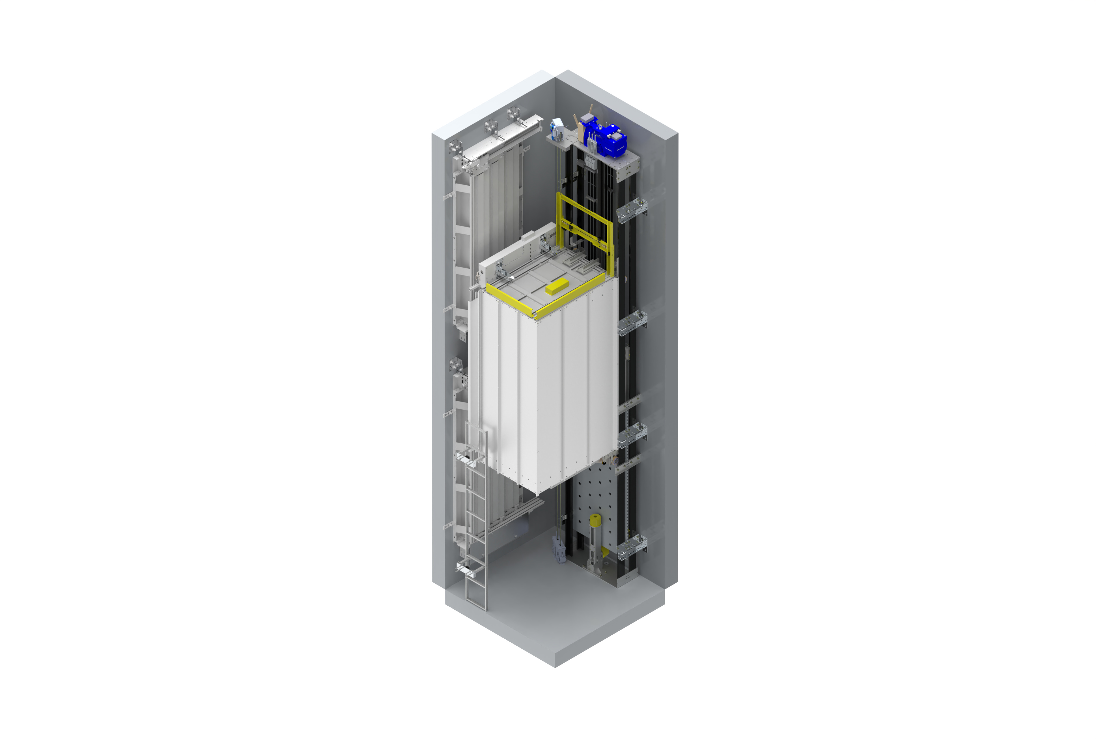
Hello, When I receive a render, the image quality becomes very low. Even if I make the same settings as my friend’s rendering settings, it doesn’t help. I will share with you the rendering images taken from 2 different computers.thank you for your help.
Hello Ahmet!
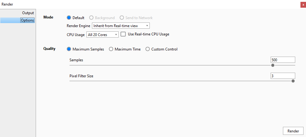
The amount of samples only define how many times the image will be calculated and refined; each sample will smooth out grain/noise in the image - so this doesn’t change much as long as the materials and the light-settings are not well executed.
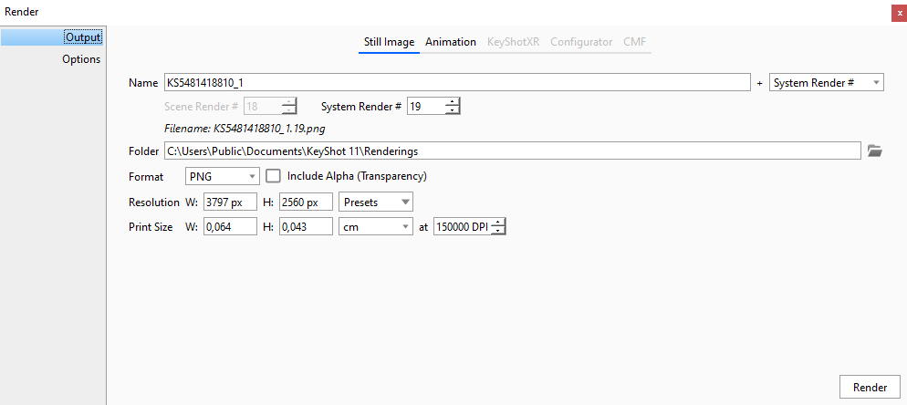
Also: why do you have 150.000 dpi?? That’s an overkill.
300dpi is more than enough, used in magazines
Show more about your light setup and one materialgraph.
Kind regards.
2 Likes
It looks like there are really different lighting and materials being used. And I think the second image also uses AO on materials (or done in POST) so you get some extra shadows and more depth in the image.
Be sure if you create materials you don’t pick a total black (0/0/0) or total white (255/255/255) as diffuse/albedo colors since a renderer can’t do much with an absolute white or black. They are also non-existent in real life except some weird nano based paints 
2 Likes
I concur with most of the other observations. 500 samples with that much DPI is really unnecessary for any usage. Print generally requires the most DPI which generally use at most 300dpi. If you are running CPU rendering, I generally find you don’t often need more than 80 samples.
In terms of quality, I am unsure what you mean? Your materials you chosen to use look very rudimentary to me and lacks any sort of texture to make it real. The material library has many great materials, but they are often just a starting point for CMF application to models and often need tweaking to make the model look realistic. Lighting also plays a big part in selling the quality of your model. There is certainly a place for flat and soft lighting, but often this leads to very sterile looking images that come off looking unrealistic, as flat lighting like this doesn’t often appear in real life without many large light sources in comparison to the object in question.
For example, here is a product render I done of a newly launched controller my company produces.
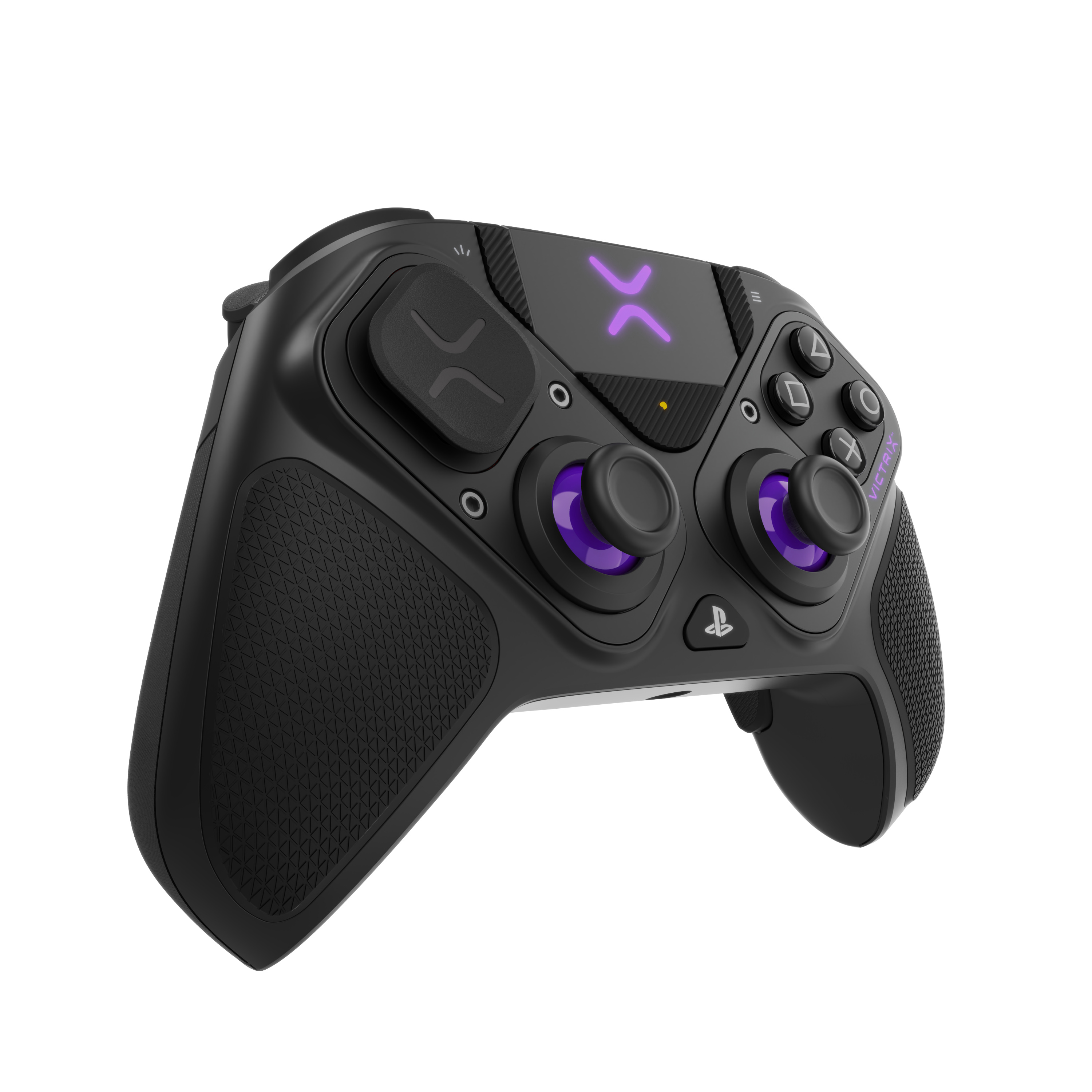
There are many small intricate details built into the materials for every down to the basic black faceplate. While individually, these details don’t make a huge difference and I would even say hard to recognize, it is all the small details combined together that sell the realism of your product.

Here is another example of a product that has more reflective objects in there.

I had help from my boss to create this texture as it was a doozy to attempt to figure out and make it look like the real thing as the material node for this looks like a bowl of spaghetti.
The quality of your renders I personally think look fine for maybe an instruction manual or illustrative design, but if you are trying to emulate realism, you will need to spend a bit more time in fine tuning your materials and adding minor details. Your model also looks like it has way to sharp edges, which generally don’t occur in real life to such perfection - adding corner rounding to the over all model and more on specific parts will help with this immensely. If you wanted to fine tune it even more, the corner rounding only goes so far, I would almost bring it back into the modeling software and add small bevels to almost every surface.
Just my observations, but I am still a 3D n00b, so take it for what it is worth.
1 Like
There are a lot of things behind a number of samples, which affect output quality. Are the materials applied all the same? Is lighting the same? Do you use ‘Product’ or ‘Interior’ rendering engine? Do other settings in the ‘Lighting’ tab match? Same for postprocessing settings in the ‘Image style’ tab?
P.S. Don’t trick people, set your output image size in proper dimensions and resolution, those who look only at resolution but overlook 0.6x0.4mm size come to wrong conclusions
My quick bet: your lighting tab set to ‘basic’ or ‘performance’ preset instead of ‘Product’.